You’ve finally decided it’s time. No more DIY templates. No more relying on that site your cousin built in 2019. You’re ready to invest in a professional online presence. But here’s the hard truth that nobody tells you: 70% of small business websites fail to generate meaningful leads or conversions . They don’t fail because the business is bad; they fail at the very first step. They fail in the planning stages.
We’ve sat across the table from dozens of business owners just like you. They come to us with a concept and a budget, but often, they’re unknowingly walking into a trap. They confuse a “beautiful” website with a “profitable” one. The common mistakes in website design planning aren’t just about picking the wrong color or font. They are strategic errors that can cost you thousands in lost revenue and leave you invisible on Google.
Quick Answer: The most common mistakes in website design planning are treating the site as a digital brochure rather than a conversion engine, designing for desktop first (killing the mobile experience), hiding your value proposition above the fold, and ignoring technical SEO until after launch. The fix requires a shift from aesthetic-focused thinking to a strategy-driven, user-centric planning process.
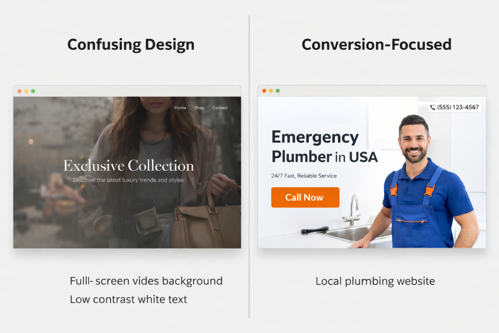
The “Pretty but Pointless” Trap: Why Aesthetics Aren’t Enough
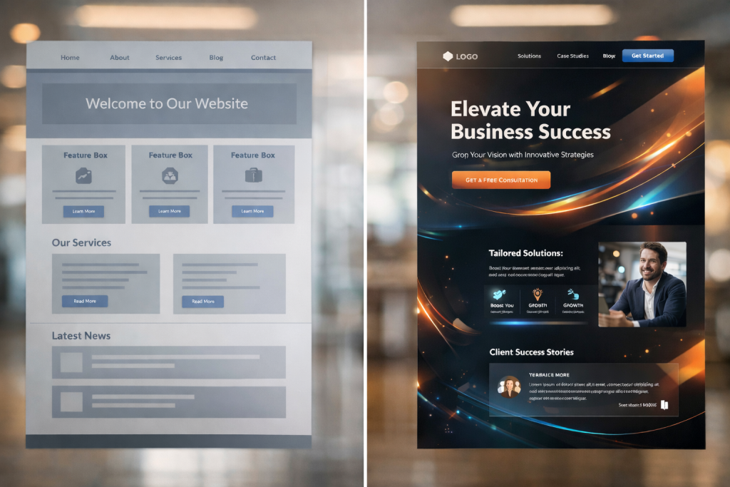
We’ve all seen them. The websites with the full-screen video backgrounds, the fancy animations, and the moody, low-contrast photography. They look like art. But try to find a phone number or understand what the company actually does within five seconds. You can’t.
One of the most pervasive web design mistakes in the planning phase is prioritizing the “wow factor” over functionality . Business owners see cutting-edge sites from global brands and think, “I want that.” But here’s the reality: what works for a luxury fashion brand will sink a local plumbing company.
The Analysis: Cognitive Load and Confusion
When a visitor lands on your site, they make a subconscious decision to stay or leave in under 0.05 seconds . If they are met with a cluttered layout or a confusing interface where nothing is immediately clickable or understandable, they experience high cognitive load. They have to work too hard. And in a digital world where 71% of consumers have ended relationships with companies due to poor customer experience, hard work means they leave .
The Solution: The “Clarity Above All” Framework
We use a proprietary method called the “First 5-Second Test.” Before we design a single pixel, we define exactly what a visitor must see, understand, and feel in the first five seconds. This means:
A crystal-clear value proposition: Your headline must state exactly what you do and who you do it for.
An obvious primary action: The “Get a Quote” or “Book Now” button must be immediately visible without scrolling.
Visual hierarchy: We guide the eye using contrast and size, not clutter.
If your design is beautiful but your bounce rate is high, you haven’t built a website; you’ve built a beautiful dead end .
Building for Desktop First (And Killing Your Mobile Traffic)
Did you know that over 60% of web traffic now comes from mobile devices ? And yet, one of the most common small business website mistakes is planning a desktop experience and then trying to “shrink it down” to fit a phone.
We recently had a potential client come to us, frustrated that their leads were drying up. They had spent $15,000 on a new site, but their conversion rate had plummeted. When we pulled up their site on an iPhone, the text was tiny, the buttons were the size of a fingernail, and you had to pinch and zoom just to click “Contact Us.” They had effectively fired 60% of their audience.
The Proof: The Three-Second Rule
Google’s research is clear: if your page takes longer than three seconds to load on mobile, 53% of visitors will abandon it . Combine a slow load time with a non-responsive layout, and you’ve created a lead-repellent machine. We saw one client in the service industry increase their mobile conversion rate by 40% simply by switching to a mobile-first design that prioritized thumb-friendly navigation and fast-loading hero images.
The Action: Plan for the Small Screen First
In your planning phase, you must adopt a mobile-first mentality. This means:
Prioritizing content: What is the single most important thing a mobile user needs? Put that at the top.
Simplifying navigation: Complex mega-menus don’t work on phones. Use clear, concise hamburger menus or bottom navigation bars.
Thumb-friendly CTAs: Ensure buttons are large enough (at least 44×44 pixels) and placed where thumbs naturally rest .
When you plan for mobile first, you create a cleaner, faster, and more focused experience for everyone—including desktop users.
Hiding Your Calls-to-Action (The “Where Do I Click?” Problem)
Imagine walking into a physical store, ready to buy, but you can’t find the sales counter. You wander around, see products, but there are no signs. Eventually, you just leave. That’s what happens on websites with weak or buried calls-to-action (CTAs).
A staggering 38.5% of designers identify a lack of clear CTA buttons as a top conversion killer . In the planning stage, businesses are often so focused on their “About Us” story or their service list that they forget to tell the visitor what to do next.
The Case Study: The Generic CTA vs. The Benefit-Driven CTA
We worked with a financial advisor whose homepage CTA was “Learn More.” It was grey, small, and sat at the very bottom of the page. We replaced it with a high-contrast button in the top right and middle of the page that read, “Book Your Free, No-Obligation Strategy Call.” We also added a secondary option: “Download the Retirement Checklist.”
The result? A 150% increase in consultation requests in the first month. The difference wasn’t just the button color; it was the planning. We mapped out the customer journey and realized visitors needed a low-commitment entry point (the checklist) and a clear path to high-value action (the call).
The Framework: The “Conversion Ladder”
During our planning phase, we don’t just design pages; we design the conversion architecture. We ask:
What is the primary action? (e.g., Request a quote)
What is the secondary action? (e.g., Call now, read case studies)
What is the nurturing action? (e.g., Sign up for the newsletter, download a guide)
Each of these actions needs a visually distinct, prominently placed button. If your CTAs are an afterthought, you are leaving money on the table.
SEO: The Afterthought That Kills Visibility
Perhaps the most expensive mistake we see is treating SEO as a “launch day” task. Business owners plan the design, the copy, and the images, and then ask, “Okay, how do we get people here?” By then, it’s often too late, or it requires a costly redesign.
If your site isn’t planned with search engines in mind from Day 1, you are building a beautiful shop in the middle of the desert. No one will find it.
The Deeper Insight: Topical Authority and Site Structure
Effective SEO isn’t about keyword stuffing anymore . It’s about building a structure that Google understands and trusts. In the planning phase, we create a content hierarchy. If you are a plumber, we don’t just plan a “Services” page. We plan a pillar page on “Plumbing Services” and cluster pages on “Emergency Plumbing,” “Leak Detection,” and “Water Heater Repair.”
This structure, planned in advance, establishes topical authority. It tells Google you are an expert in your field. We also plan for technical elements:
Schema Markup: We code the site to help Google understand your reviews, your business hours, and your services.
Core Web Vitals: We plan for fast loading times by choosing the right hosting and optimizing images from the start, not as a fix later .
When you integrate SEO services into the design planning, you build a foundation for growth. If you add it as an afterthought, you’re just patching holes.
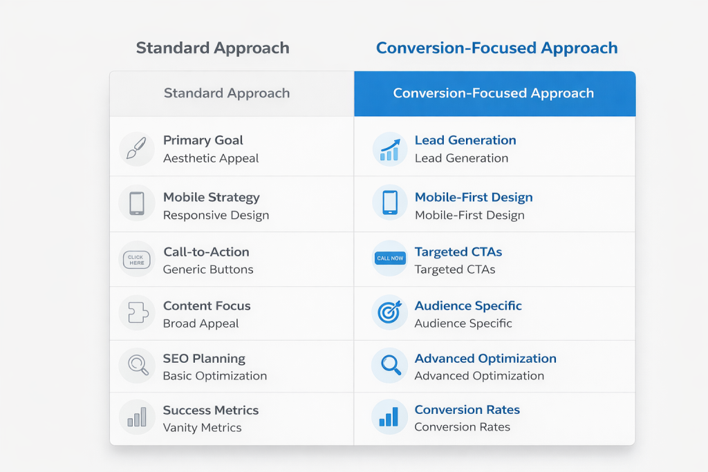
The Comparison: How Does Your Planning Stack Up?
To help you visualize the difference between a standard approach and a conversion-focused strategy, here’s a simple comparison.
| Planning Phase Element | The “Standard” (Mistake-Prone) Approach | The Conversion-Focused (Webiyan) Approach |
|---|---|---|
| Primary Goal | To look modern and professional. | To generate leads, sales, and build brand authority. |
| Mobile Strategy | Desktop designed first, then adapted for mobile. | Mobile-first design, ensuring speed and usability on small screens. |
| Call-to-Action (CTA) | “Contact Us” or “Learn More” placed in the navigation. | Benefit-driven CTAs like “Get My Free Quote” placed strategically throughout the page. |
| Content Focus | “We are a great company. Here is our history.” | “Here is how we solve your specific problem. Here is proof.” (Customer-centric). |
| SEO Planning | An afterthought; keywords added to finished copy. | Foundational. Site structure, schema, and keywords are planned before writing a word of copy. |
| Success Metrics | “Does it look good?” | “How many qualified leads did it generate this month?” |
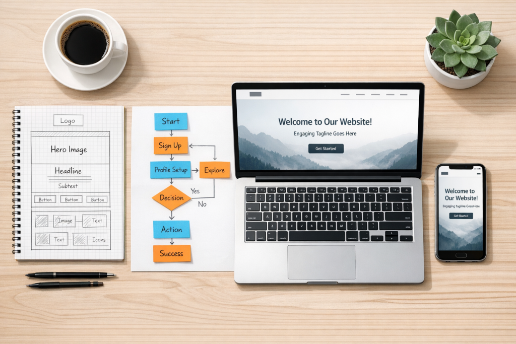
Three Non-Negotiables for Your Website Planning Process
Based on our experience helping businesses avoid costly redesigns, here are three actionable steps you must take during the planning phase.
1. Define Your User’s Job-To-Be-Done
Before you write a line of copy or sketch a layout, you must understand why a user is coming to you. Are they there to research a problem? Are they ready to buy? Are they looking for your physical address?
The Exercise: Write down the top three “jobs” your website must do (e.g., Get someone to book an appointment, prove we are more experienced than Competitor X, show photos of past work).
Every design decision should then ladder up to supporting these three jobs.
2. Map the “Zero-Second” to “Five-Second” Journey
This is our proprietary “Micro-Conversion Audit.”
Second 0-1: Does the logo link to the home? Does the headline confirm they are in the right place?
Second 1-3: Does the eye naturally move to a compelling image and a supporting sub-headline?
Second 3-5: Is the primary CTA visible and compelling enough to make them want to scroll or click?
3. Plan for Trust, Not Just Traffic
Don’t just plan for how people find you; plan for how people trust you. In your planning, decide where trust elements will live:
Social Proof: Client testimonials and logos of companies you’ve worked with should be prominent, not hidden on a separate page .
Contact Information: Is your phone number in the header on every page? Is there a clear contact page with a map and a form? Don’t make people dig .
Security: Ensure your sitemap includes SSL certification and clear privacy policies, especially if you are collecting data .
Frequently Asked Questions (FAQs)
What is the single biggest mistake in website design planning?
The biggest mistake is failing to define a clear goal for the website beyond “looking good.” Without a specific goal (like generating 10 new leads per week), the design lacks direction, and you can’t measure success.
How do I know if my website is losing customers due to bad design?
Check your analytics. A high bounce rate (over 70%), low time-on-page, and a poor conversion rate are key indicators. You can also use tools like heatmaps to see if people are clicking on non-clickable elements, which signals confusion.
Can I fix SEO mistakes after my website is built?
Yes, but it is often more expensive and time-consuming. Fixing a poor site structure or slow page speed after launch may require a partial redesign. It’s always more efficient to build SEO services into the initial planning phase.
How often should I update my website design and planning?
A full redesign is typically needed every 3-5 years. However, you should constantly be iterating based on user data. If your conversion rate drops or your analytics show a shift in user behavior, it’s time to revisit your plan.
Your Next Step: Build a Website That Works as Hard as You Do
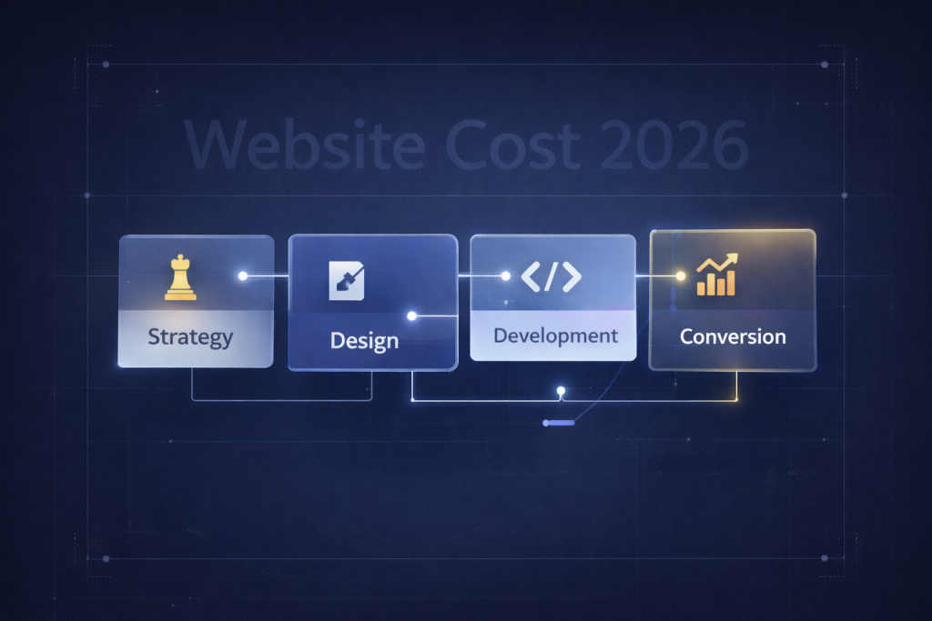
Planning a website isn’t just about picking a template; it’s about engineering a tool for growth. You’ve seen the pitfalls—the “pretty but pointless” designs, the mobile nightmares, the buried CTAs, and the invisible SEO. These common mistakes in website design planning are not just minor annoyances; they are silent killers of your business potential.
You deserve a website that doesn’t just sit there, but one that actively works to build your brand, rank on the first page of Google, and convert visitors into paying customers. You need a partner who plans for performance from the very first conversation.
Don’t let your next website be another statistic. Let’s build one that actually generates revenue.